Role
Access Control & Management
Focus Area
Visual design system, UI consistency, product polish
Partners
Product Managers, Engineers, Design Leadership
Timeframe
2015 - 2017
Kisi:
Kisi is a cloud-based access control platform that enables organizations to manage secure entry systems across offices, co-working spaces, and enterprise environments. As the product evolved, the team needed a stronger, more cohesive visual design system that could scale across product surfaces while maintaining clarity, consistency, and brand trust.
I partnered with product and engineering to help elevate Kisi’s visual language, improve UI consistency, and establish a stronger foundation for product growth.
Visual Design System & Product Experience


Let's get into the details
What did I do?
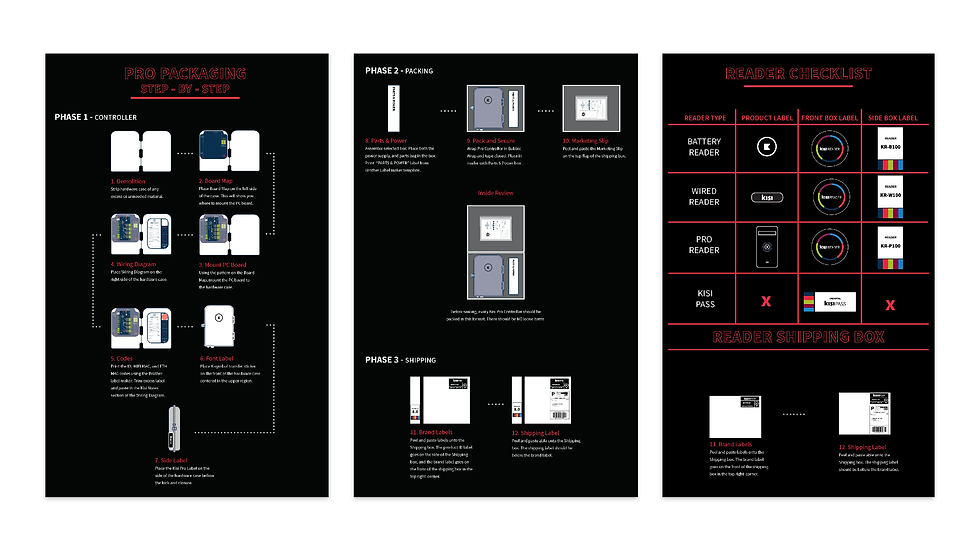
I contributed to their design system by developing a consistent color palette and submarks that coincide with the existing logo. I also created branded merchandise and partnership/integration platforms, and collaborated on web design and UI for both desktop and mobile apps.
Who did I work with?
As a small startup (under 10ppl at the time),I was able to collaborate directly with my shareholders, engineers and marketing peers to orchestrate new projects and keep the brand consistent
What value did I add?
During my time with Kisi, I was able to develop and grow their design system. I also improved manufacturing consistency, and user guides creating cohesion between the physical and digital products.

The Challenge
As Kisi’s product matured, visual inconsistencies began to emerge across the platform:
Key challenges included:
-
UI components lacked consistency across features
-
Spacing, typography, and hierarchy varied between screens
-
Design decisions were being re-made repeatedly
-
Engineers lacked a single source of truth for UI patterns
-
The product experience felt functional but visually fragmented
While the core UX was solid, the visual layer needed structure to support scalability, speed, and long-term maintainability.
The challenge wasn’t redesigning the product from scratch — it was bringing cohesion, clarity, and polish to an already complex system.
Goals & Metrics
The primary goals of this work were to:
-
Establish a consistent, scalable visual design system
-
Improve UI clarity and hierarchy across product surfaces
-
Reduce friction between design and engineering
-
Create reusable components that accelerated delivery
-
Elevate the overall quality and perception of the product
Audit & Insights
Through UI audits and cross-functional conversations, a few patterns emerged:
-
Similar components were styled differently across features
-
Inconsistent spacing weakened hierarchy and scannability
-
Visual noise made complex workflows feel heavier than necessary
-
Engineers often needed clarification on intended UI behavior
These insights made it clear that the product didn’t need more features — it needed alignment.
My Role & Responsibilities
I focused on strengthening Kisi’s visual foundation through system-level thinking and execution. My responsibilities included:
-
Auditing existing UI patterns across the product
-
Defining visual standards for typography, spacing, and layout
-
Designing reusable components aligned with brand principles
-
Refining interaction states and visual hierarchy
-
Translating design decisions into developer-ready assets
-
Maintaining clean, organized Figma libraries
-
Collaborating closely with engineers to ensure feasibility
This work required attention to both micro-level details and macro-level consistency.

1. Visual Design System Foundation
I helped define a clear visual system that established:
-
Consistent typography scale and usage
-
Unified spacing and layout rules
-
Standardized color application for states and feedback
-
Clear hierarchy for primary vs secondary actions
This created a shared visual language across the product.
2. Reusable UI Components
I designed and refined core components that could be reused across multiple product surfaces, including:
-
Buttons and CTAs
-
Form fields and inputs
-
Navigation elements
-
Status indicators and feedback states
These components reduced redundancy and improved design-to-dev handoff.


3. Product UI Refinement
Beyond system work, I applied the updated visual standards directly to product screens to:
-
Improve readability and scannability
-
Reduce visual clutter
-
Strengthen alignment and spacing
-
Make complex information feel more approachable
The result was a cleaner, calmer interface without sacrificing functionality.
4. Design–Engineering Alignment
I worked closely with engineering to ensure:
-
Visual decisions were technically feasible
-
Components mapped cleanly to code
-
Design intent was clearly documented
-
Iteration cycles were faster and smoother
This partnership helped translate design into production more efficiently.


Impact & Outcomes
While specific metrics were internal, the visual system work delivered a meaningful qualitative impact:
-
Increased UI consistency across the product
-
Faster design and development workflows
-
Reduced ambiguity during implementation
-
Improved overall product polish and professionalism
-
Stronger foundation for future feature expansion
Most importantly, the product experience felt intentional and cohesive rather than piecemeal.
Reflection
This project reinforced that strong design systems aren’t about rigid rules — they’re about empowering teams to move faster with confidence.
By bringing structure to Kisi’s visual language, we created:
-
Better collaboration between design and engineering
-
A more scalable product foundation
-
A calmer, clearer experience for users
It was a reminder that great product design often lives in the details — and that visual consistency is a powerful form of UX.